Want to know how to get the best web design? Keep reading to find our ten top tips.
Most businesses of all backgrounds and sizes have a website. In fact, it would be a shock if you came across a business that didn’t have a website or some form of online presence.
Although, if you want to compete against businesses in your industry then having the best web design is what’s really going to set you apart.
Why is having the best web design important?
Websites are key for businesses for a number of reasons. They provide a space for audiences to; gather information, purchase products, make a booking, or find contact information. However, there are some websites out there that people just want to avoid. As things in the digital marketing world change, so do websites. It has to stay current and, unfortunately, there are thousands of websites out there that just aren’t appealing to us as an online audience anymore.
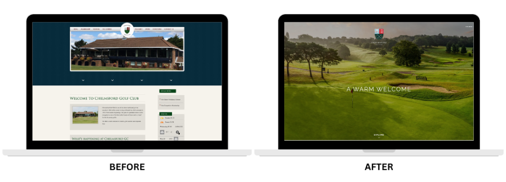
Take these two images for example. The website on the left would’ve been fine back in 2012. While the website on the right looks cleaner with high-quality photographs, suiting today’s desired look and feel of a site.
Which do you prefer? I guarantee you’re thinking the web design on the right!
2012 might not feel long ago to you, however the digital world has changed so much over the past few years. What worked over a decade ago now doesn’t work so well. That’s why Chelmsford Golf Club made the sensible decision to elevate their website.
So, let’s get into some tips for making your website the best it can possibly be.
Top 10 best web design tips
If your website needs an upgrade or you’re looking to build one from scratch, take a look at these 10 things you need to build a successful one.
1. Design for mobile
Creating a website that is mobile friendly in 2024 is absolutely vital as 70% of web traffic comes from mobile phones. Therefore, if 70% of your audience are coming from a mobile then it’s an absolute no-brainer that your site has to work efficiently on all devices.
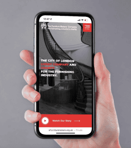
Take a look at The Furniture Makers’ website as an example of a mobile friendly web design.
This ties in nicely with the fact that a successful website always focuses on user experience. What makes a website successful depends on how often and how long a consumer stays on the page. If your audience doesn’t enjoy their experience on your website, then they aren’t likely to come back to it in the future.
So keep these top tips in mind:
– Sometimes less is more – keep your website simple and don’t overcomplicate things.
– Make sure it’s easy to navigate – keep your menu clear and your services easy to access.
– Think of how you’d like your experience to be – if you’re not happy with it, then neither will your audience.
2. Keep it simple
It can be good to take risks at times, although when it comes to creating a website sometimes it’s actually best to follow the crowd (hint: people like simplicity).
Google carried out a study regarding people’s first impressions of websites. The study shows research into what people thought about web designs. The outcome? They found that people perceived websites with more complex designs as less beautiful. Therefore, don’t over complicate it!
A top tip for keeping your website simple is to follow the usual web design standards.
Some web design standards include:
- Main navigation in header
- Dropdown menus
- Descriptive heading at the top
- Search bar in the header
- Logo in the top left
Take a look at our website header as an example.

Sticking to these website standards means that users can navigate your site better.
The Principles of Beautiful Web Design explains how the possibilities of website layouts are endless. However, only a few of those layouts make a good design.
So, we’d recommend not overcomplicating the design of your site. Instead, keep it clean and simple! If you want to keep your website simple but fresh, check out these custom web design services.
3. Define your goals
In order for your website to be a success, you have to define your goals before you begin to design it. You can’t go in blind-sighted and expect it to work itself out. Instead, have a plan. To define your goal, you need to think about exactly what kind of information you want your website to convey.
Here are some things to consider:
– Products/services – to provide information about what you sell and give your audience access to purchase this.
– Case studies – showcase your previous work. This is a great way to show off your best work to customers (and your competitors).
– ‘About Us’ – share your backstory with your audience and explain exactly what you do. Everyone loves to gain a deeper insight behind a company and to know exactly what your services will offer them.
– Contact information – if you’re a company that takes pride in customer service, utilise this through your website.
Your goals can be shown in various ways on your website through things such as copywriting, images, and brand voice. Just ensure it stays consistent and relevant to your target audience. When you work with our expert web designers, we guarantee you’ll be happy with your website’s new web design.
4. Optimisation strategies

Building a website that looks nice, works efficiently and is user friendly is all well and good, however this won’t mean anything if you don’t have a good strategy in place for search engine optimisation (SEO).
SEO is the process of optimising a website’s content, structure, and technical elements to improve its visibility and ranking in search engine results pages (SERPs) for relevant keywords and phrases. This is integral when designing a website as the goal (most likely) will be to appear on the first page of search engines like Google.
There are many things to consider when it comes to having a good SEO strategy, but here are four key tips to consider for now:
– Use relevant keywords on your site
Key words are vital for making sure your website is seen for all the right reasons. When it comes to writing content for your website, using keywords that align with your target audience’s search queries is key. This increases the likelihood of your website appearing in search results when users are actively seeking information related to your products or services.
– Use titles and meta descriptions for each page
Titles and meta descriptions serve as concise summaries of the content on each page of your website. These provide both search engines and users with valuable information about the page’s content and relevance before actually clicking onto it. Well-written titles and meta descriptions that accurately reflect the content of your pages can enhance user experience and contribute to higher search engine rankings.
– Optimise your images using alt text and captions
Images are, of course, an essential component to any visually appealing web design. However, they also present an opportunity for SEO optimisation. By optimising images with descriptive alt text and captions, you can improve accessibility for visually impaired users and provide search engines with valuable context about the content of your images. Including relevant keywords within each image helps search engines understand the relevance of your images to users’ search queries, so enhances your website’s overall SEO performance.
– Ensure your content is original and high quality
Search engines prioritise websites that provide valuable, relevant, and authoritative content to users. By consistently publishing original, informative, and engaging content that addresses the needs and interests of your target audience, you can establish your website as a credible source of information in your industry. High-quality content not only attracts organic traffic but also encourages social sharing, backlinks, and engagement, all of which contribute to improved search engine rankings and increased visibility for your website.
You can make your web design as pretty as you like, although if you don’t have an SEO strategy in place it’s going to be difficult to rank high on search engines. And when you don’t rank high on search engines, it makes it difficult for visitors to find your page.
5. High quality images

First impressions matter. In fact, it only takes a matter of seconds for people to form an initial first impression.
Now, usually at the top of a web page you’ll see a visual of some sort – whether that’s an image, graphic or video. As this is the first thing your user will see, it’s important that this imagery is high quality. This helps to make your website look professional.
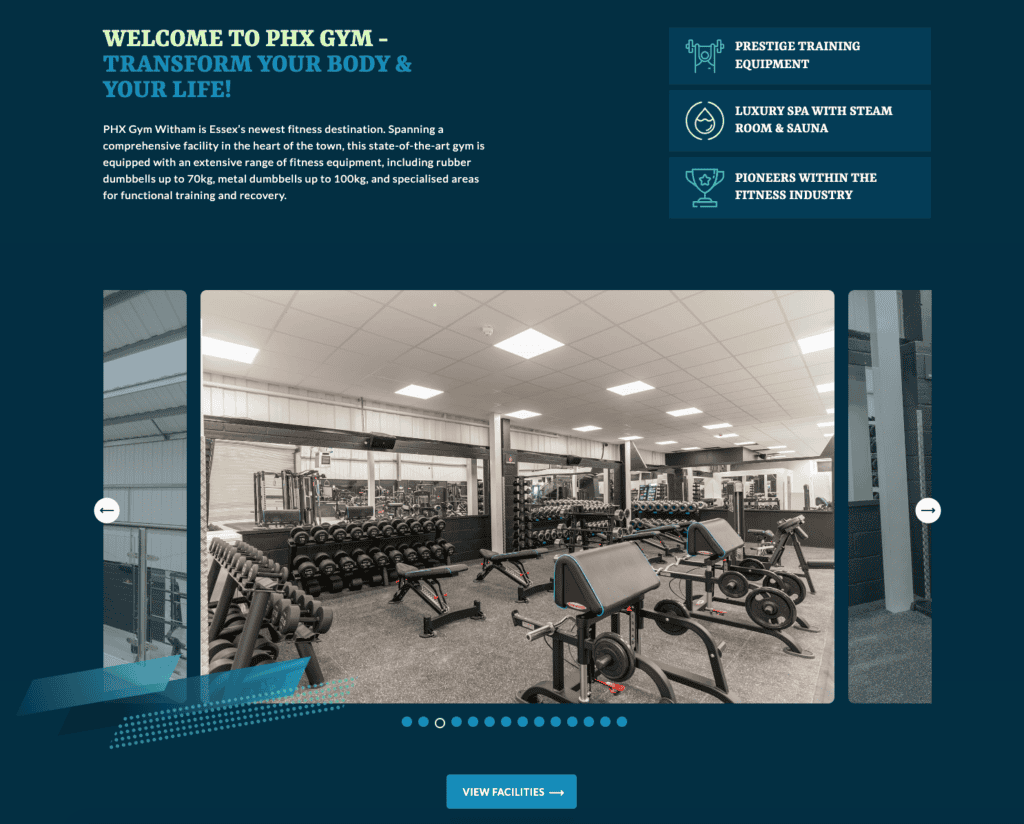
As well as ensuring the imagery looks top-notch, it’s also important to ensure they are relevant. This enables people to visually see what you offer within a split second. Take the image above as an example. PHX Gym Witham use high quality imagery on their homepage to show off their gym facilities (which looks great)!
Finally, you’ll want to make sure your images are optimised for web use to maintain fast load times. Mailchimp explains how images that aren’t optimised can slow down your website to the point that it’s difficult to navigate and frustrating to use.
Check out our web design seo services for more info.
6. Easy to read website copy
As well as high quality imagery, the copy content on your website should be easy for the user to digest.
‘Readability’ makes all the difference to the performance of a website. If it’s easy to read, your users will have a better experience while browsing your site.
There are a few things to consider when improving the readability of a website, including:
- Font type – make sure this is simple to read. Sans Serif is usually a good choice. We also recommend choosing no more than three different fonts to ensure your web design is consistent.
- Font size – ensure users can actually read the text on screen. To assist in your successful web design, we’d recommend around size 16pt.
- Web copy – you should always ensure the copy on your website is easy to follow. You might consider hiring a website copywriter to assist you in writing or editing this at least.
This follows the theme of keeping your website clean and simple.
7. Consistent branding
A good website will ensure the branding is consistent throughout. This instantly allows users to recognise your brand (especially if they recognise your brand image anyway).
Brand consistency avoids any confusion for your users. Forbes reports that maintaining a consistent colour palette across your brand’s logo, digital content, and promotional materials can enhance brand recognition by up to 80%.
8. Include social media buttons
Your online presence shouldn’t stop at a website. You should also be leveraging social media, which ties in nicely with your web design.
Make sure to include social media buttons on your website (and vice versa). This allows users to check out your socials to see what you’re up to, engage with your content and eventually convert.
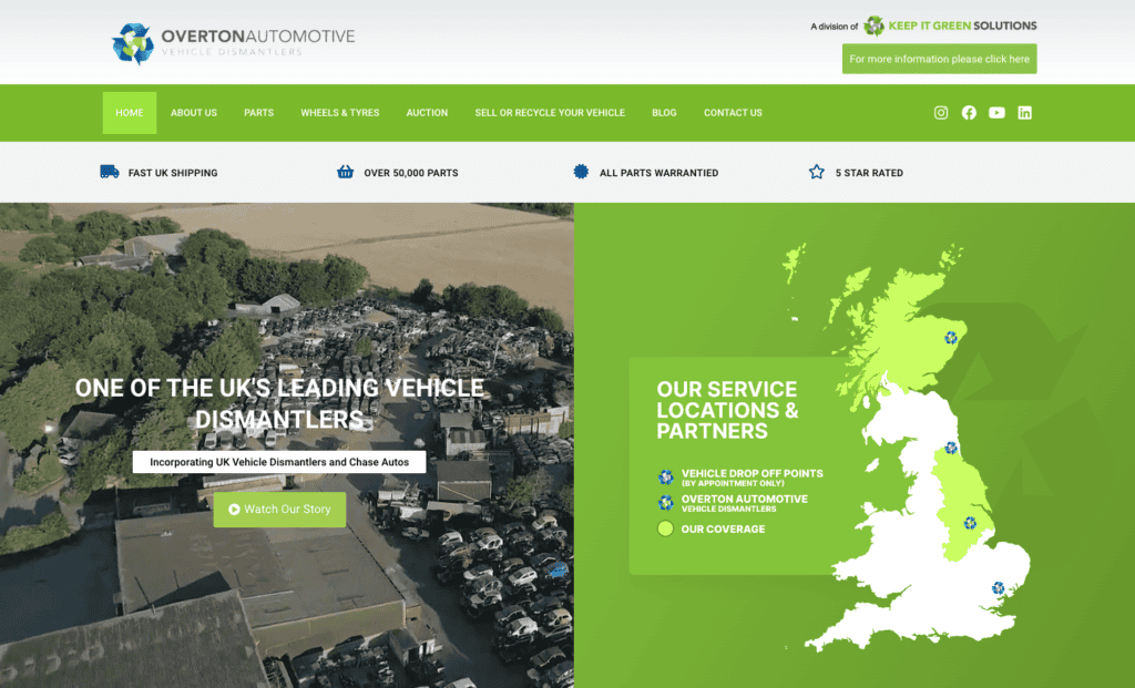
Take a look at the placement of Overton Automotive’s social media icons as an example.

Check out our social media marketing services if you’re interested in levelling up your online presence.
9. Include call to actions (CTA)
A basic element of design, but a very important one, is call to actions. Don’t hide these away in your web design. Instead throw them in the face of the user! That way they’ll know exactly what’s required for them to make a purchase, give you a call, grab a discount code, or take action to whatever you are offering.
This could make or break your conversion rate.
10. Make sure there are no errors
To ensure your website is successful at all times, you have to make sure it’s always working.
Go through your website with a fine tooth comb to make sure there are no typos or errors that your visitors will encounter when browsing through your site.
As well as the design aspect, it’s also important to make sure it’s functioning properly too.
As soon as a website is down, it creates an issue for anyone trying to use it. It instantly loses its reliability and puts you at risk of losing customers. Imagine how frustrated you’d feel if you were trying to use a site that kept crashing. You’d simply move onto another faster website.
These web design tips are all vital to creating a successful website, but we know there are still so many things to consider. If you need a hand with your existing website, or you’re looking to build one from scratch, get in touch with us today!


