
Do you have a mobile phone?… (probably a stupid question)
Do you look at websites on it?… (probably another stupid question)
Finally, are you looking at our website, right now, on a mobile phone?…
If you answered yes to one or more of the above, you’re part of the reason that mobile friendly websites are so important.

Every year, the importance of having a mobile friendly site increases – probably in correlation to the amount of people who own mobile devices. Almost every successful site has a mobile-friendly version these days.
To give you an idea of why it’s so crucial, over half of all people browsing the internet are doing so on a smartphone. That’s a pretty big figure! Imagine if your website wasn’t optimised for all those users?
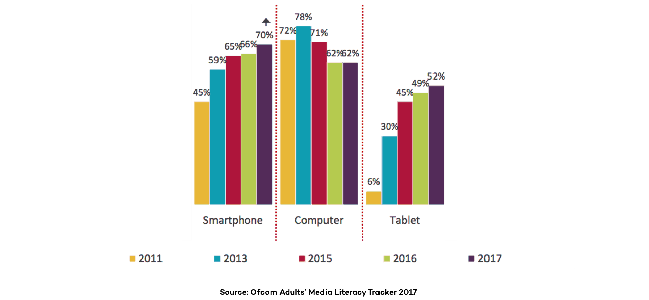
Desktop & mobile usage trends: 2011-2017
If you can’t imagine, we’ll tell you: if your website doesn’t open properly or function well on a mobile device, almost half of those all-important users will go elsewhere. The bounce-rate of your website will definitely take a hit from that, and that’ll damage your SEO too.
Let’s take a look further at why mobile friendly sites are so important, and how you can make yours better.
Mobile-First Indexing
Mobile-first indexing is a huge reason as to why you should have a mobile friendly website. Google now use the mobile version of a website to index it, meaning that it’ll become the base data for how you’re ranked in their results.
If a site doesn’t have a mobile version, the desktop version will be used, however you might not be ranked as highly as those sites with a mobile friendly site. The case is the same if your website’s mobile version isn’t optimised – they won’t rank you so high in their results.

As we all know, search rankings are crucial to the success of a business nowadays (those at the top will be getting a huge majority of the customers), which means that having a mobile-friendly site is, too.
What Makes a Site Mobile-Friendly?
A lot of things. The biggest one being actually working on a mobile phone (you’d be surprised…) We’ll give you a quick run-through of just a few of the things that our team at Page Creative design mobile friendly sites by.

First of all is how your web pages look on a phone screen. If it doesn’t fit properly and you force your audience to scroll horizontally, moving all over the place to see the full page, that definitely isn’t doing you any favours.
You also want your call to actions, for example ‘buy this product!’ (bad example – we know!), to be right there when your page loads. Have a burger menu tab to make it very easy for users to perform secondary tasks and browse your site, but make sure your CTA is the main attraction.
Users are often browsing on their mobiles on the go. That means you need to make it easy peasy for them to find want the want, fast. Make your website easy to navigate. Don’t have loads of sub-menus in your menu; mobile users just can’t be bothered to go through all that. You should also have an easy way to get back to the home page, for example by clicking the logo at the top of your screen. A clear search bar will also score you brownie points!
Another way to keep your site mobile-friendly is to make sure all of your components don’t struggle to load. This definitely isn’t good and will just turn users away. If your site speed on mobile devices is struggling, look at reducing the amount you have on your website or reduce the size of files.
Get a Professional Opinion
If you don’t think your site is mobile-friendly, or perhaps just not as mobile friendly as it could be, reach out to our team at Page Creative. We know what we’re doing when it comes to websites!

