
2018 is now in full swing (how on earth did that happen?) Christmas feels like a memory of the distant past; New Years is all but forgotten, and the first signs of Spring are beginning to poke their head out from under the frost (thanks, Beast from the East).
One of the most exciting things about a new year, is new packaging (we get genuinely excited about packaging – that’s totally normal isn’t it?) Brands are becoming so adept at understanding exactly what they want from packaging, and there are some incredible examples of packaging innovation on the market this year.
At Page Creative, we think it’s vital that we keep up with what’s going on in our industry of creative design, so we’ve been checking out all the good stuff that’s already graced 2018, and picked our favourites to bring straight to you at home. Enjoy!
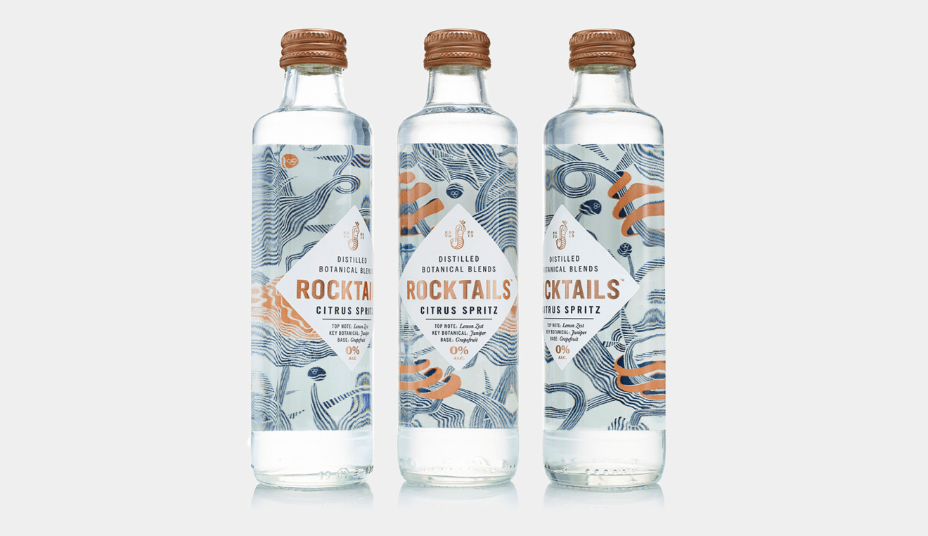
Rocktails
Making Teetotal a Whole lot of Fun
When it comes to experimenting with packaging design, the alcohol industry seems to always be one step ahead. Designers from all over the world don’t let their wildest ideas get confined within the limits of a glass bottle, as they come out with amazingly crafted labels.
However, non-alcoholic products seem to be associated with a lack of colour and vitality that could make one think that their consumers are not looking for fun, which is clearly not the case!
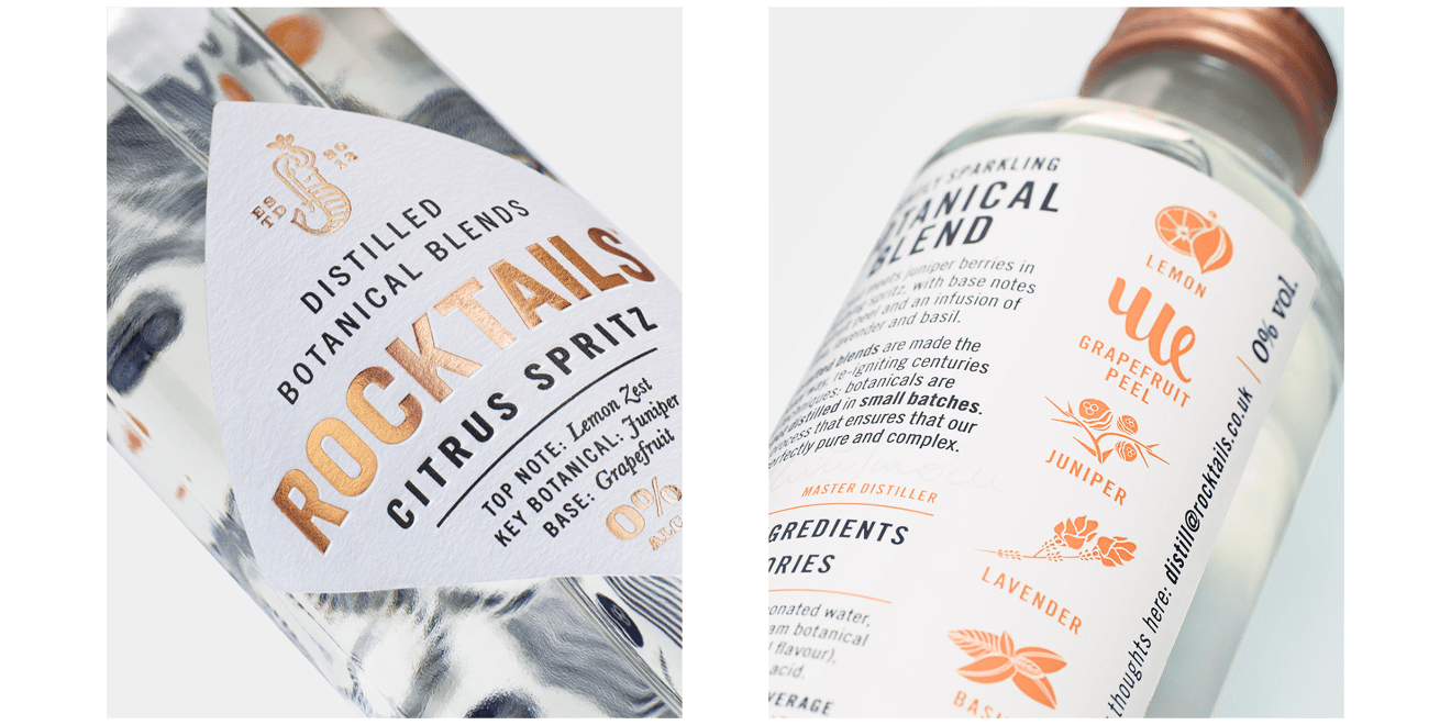
A brand turning this notion on its head, is Rocktails. They create craft-distilled botanical beverages that look boozy, but aren’t. They’re targeting foodies and use ideas most commonly associated with craft spirit packaging so that their product doesn’t look out of place in a drinks cabinet.
Their main goal was to create a beautiful bottle (score) that ‘bestowed a sense of ritual and quality’ and reflected the ingredients that they used.
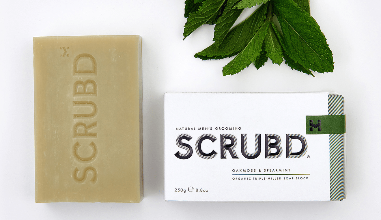
SCRUBD
Good Packaging is the Mark of a Man
It’s 2018. Men like to look, smell, and feel good just as much as women. That should’ve been obvious really, but its only over the last few years that the skincare industry has really upped its game of marketing to men. Packaging has changed dramatically too. Whilst some brands still push on with encasing all male products in a palette restricted to black, navy blue and more black, other brands are pushing the boundaries.
One such boundary pusher and game changer is a new brand called SCRUBD, aimed at the luxury grooming market. They see grooming as part of a lifestyle choice and want to make men feel great in their own skin so that they can make their own mark on the world. Hallelujah to that.
Not only is SCRUBD making men look great, it’s having a pretty positive effect on the aesthetic of their bathroom cabinets, too.
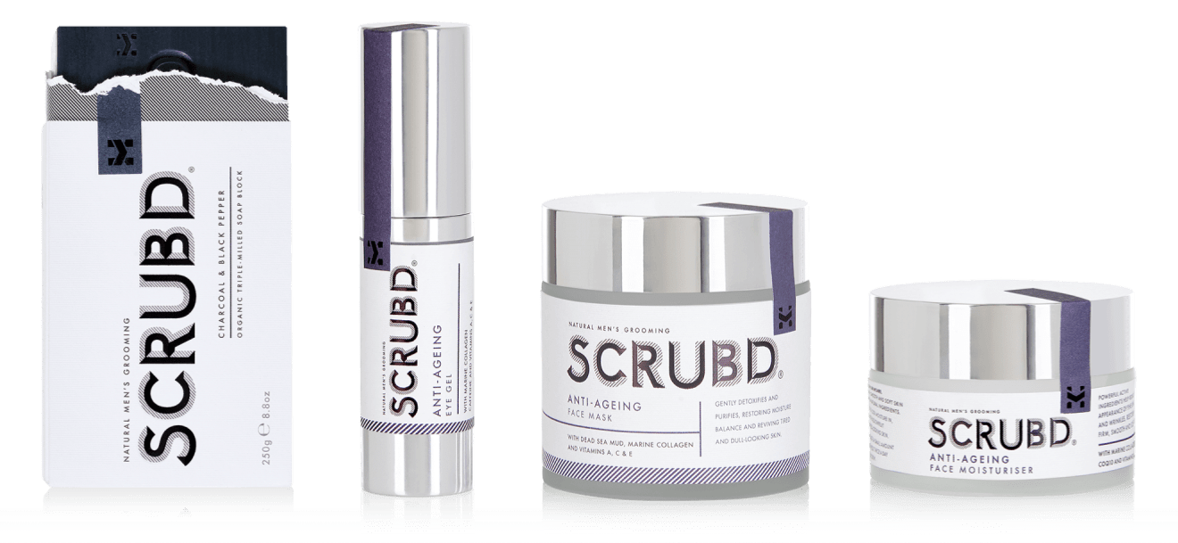
Simple textured white card, with hints of colour and a bold typeface. SCRUBD is minimalistic, masculine (without being stereotypical) and very sure of itself. It looks like a product that you want to pick up and use – whether you’re a man or a woman. It’s luxurious without being ostentatious, and we’re sure it’s going to be making big waves in the skincare industry this year.
Dang
Standing Out from a Saturated Crowd
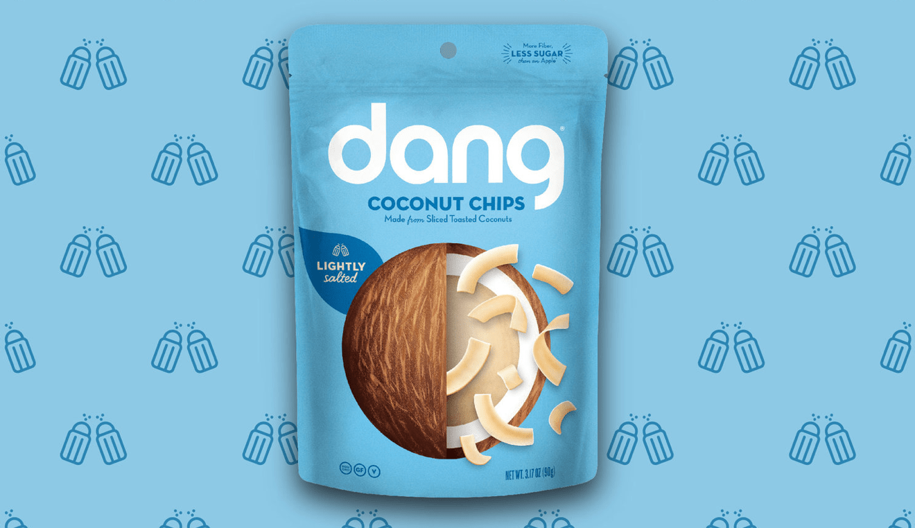
Dang is an entirely different product altogether. It’s part of the health-food snack industry, which has enjoyed a meteoric boom over the last year or so. We’ve gone from people being unable to pronounce Quinoa, to casually putting cacao nips, bee pollen and flax seeds on their Monday morning porridge. Health food sells.
Dang is Asian inspired and natural, and was doing well. However, their founder was worried that as the market became more saturated, the product’s packaging might not be able to keep up. He wanted it to be exciting, enticing, and street-food journey inducing.
Dang needed to be an ‘experience’ for consumers who felt ‘adventurous’, not just a mundane snack because they felt a bit hungry. It also needed to be a way that health-conscious consumers could indulge themselves in a healthy way.
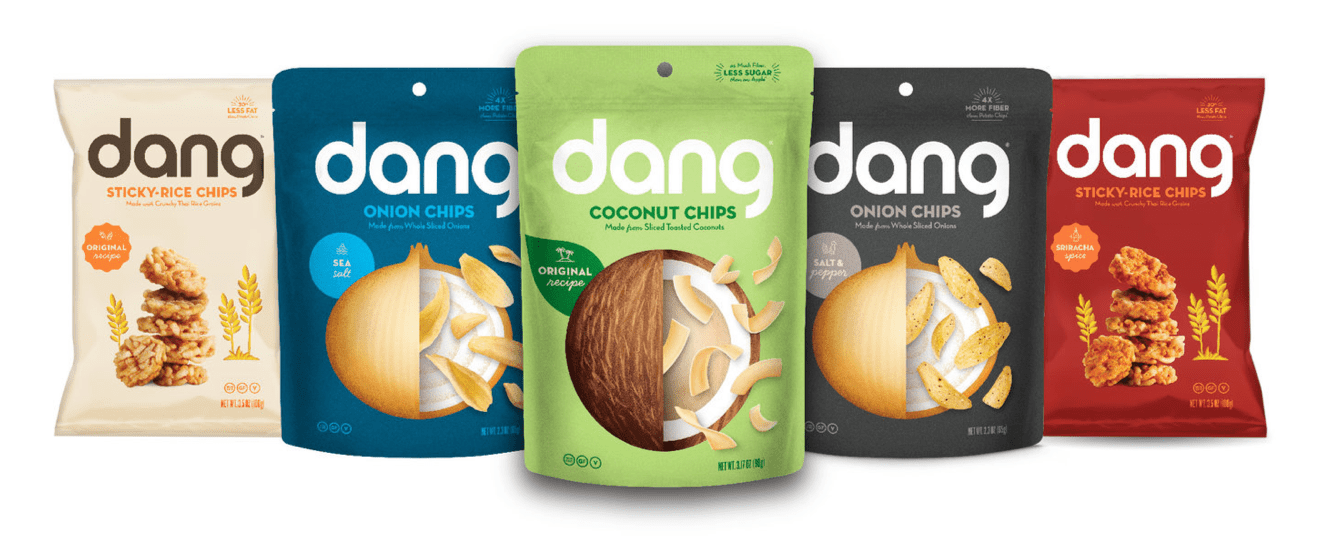
Indulgently healthy, and adventurous are two elements that really come through when you look at Dang packaging. Its bold, bright, fun, and perhaps most importantly, simple. It takes about a second to work out what’s in it, and that it’s natural. The ingredients are the main attraction, and the chips have been drawn to look almost like confetti popping out of the raw ingredient.
Dang’s product is great, but its new packaging makes it a real contender in the health food snack industry.
Utopick Chocolates
Packaging as Delectable as the Product
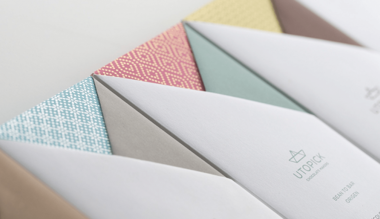
Consumers eat with their eyes. Before they’ve even tasted a product, they’ve got a preconception about what it will be like because of its packaging. Nowhere is this more true than with luxury chocolates (how often have you picked out a bar for yourself, or bought one as a gift purely because it looks pretty?)
Master chocolatier, Paco Llopis, clearly understands this concept. He and his designers created a stunningly simple, origami-esque packaging design for Utopick – a new product. The symbol, a ship, was an embodiment of adventure and a representation of the journey that cocoa pods take before they reach Spain, and the way that the card is folded at the top of the bar could be said to represent the waves of the high seas. In fact, this card folding is done by hand, adding to the luxury.

Its another example of understated packaging working well. Consumers don’t want frills and excessive design. Over the top design is no longer associated with luxury, paring things back and being measured with design is what sells these days. We don’t know about you, but we’re off to pick up a bar (or two).
2018 is set to be another exciting year for design, and we can’t wait to see other packaging products pushing the boundaries of creativity!

